loader
Local/ 00:00
NAV

HUEMAN

The goal was to shift the way clients and employees saw Hueman—as more than just a recruitment company, but as an organization devoted to the betterment of all they partner with as a growing and leading brand. More Details →

  • PROJECT BRANDED HOUSE REFRESH
  • CATEGORY BRANDING + WEB DESIGN
  • LIVE PROJECT Visit Site

RESEARCH

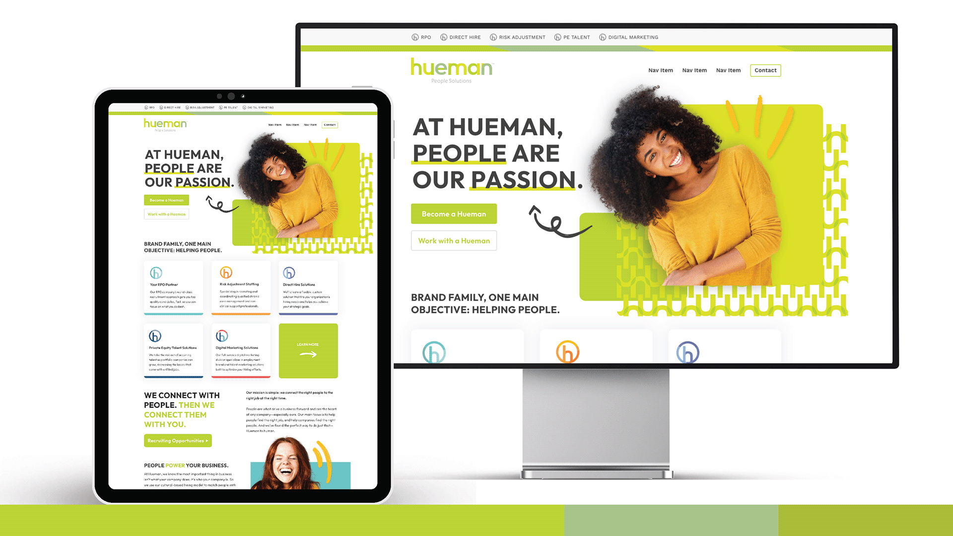
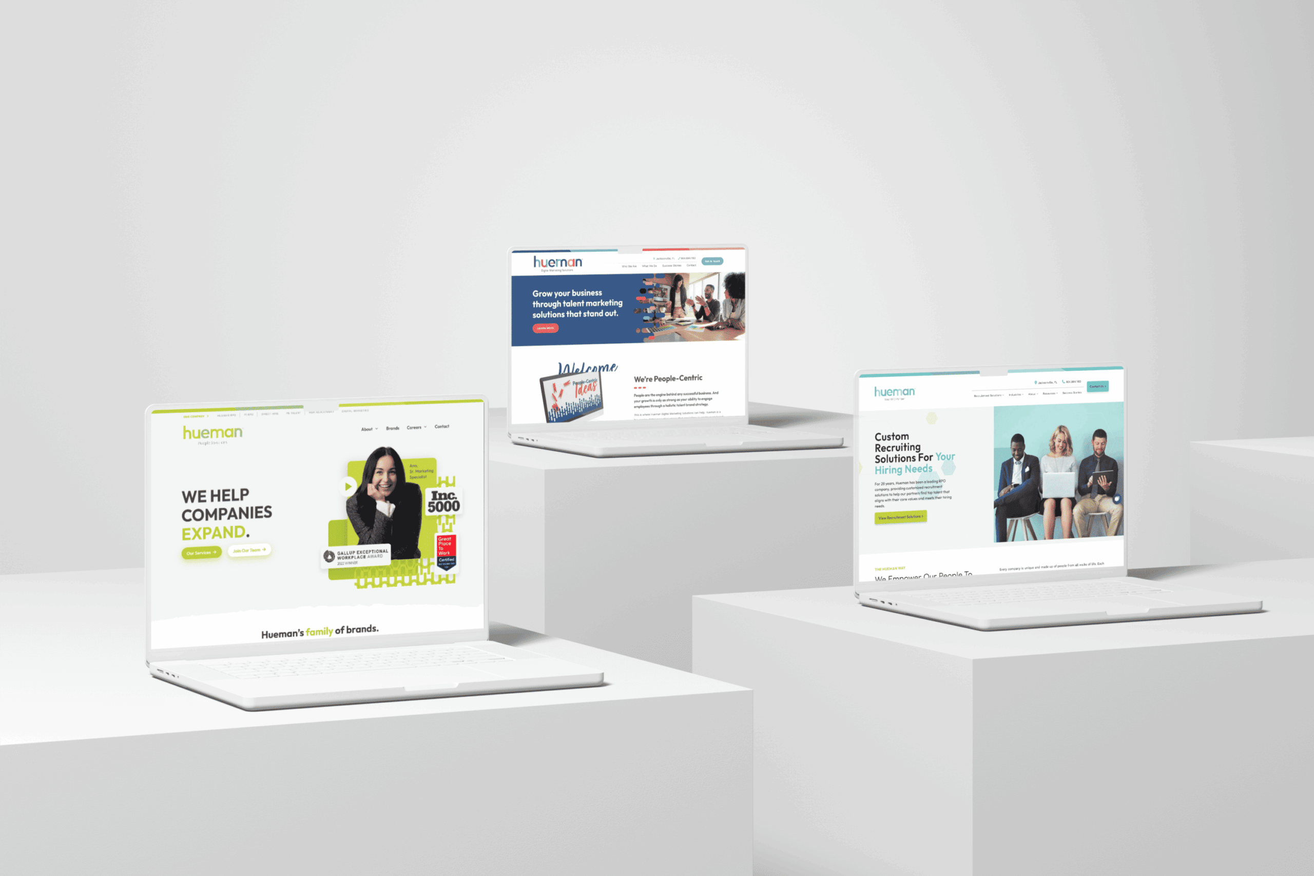
At its core, Hueman always put people first. I took a dive into the essence of what that meant and then defined it across the entire Hueman brand family. What I discovered is that Hueman isn't just about the people they serve, but the different hues that bring them together. These hues embody various perspectives, distinct ideas, diverse experiences: the things that make Hueman human. 

DESIGN

What a better way to personify that idea than using actual people? When we think about creating buyer personas, we visualize who our ideal client is that we're trying to sell to what their personal bodies and motivations are. What are their pain points? What are their demographics?  I took this same idea to better visualize each human brand and what they would look like if they walked into the room.

CONCEPT

The logos already did an excellent job at exemplifying the hues of Hueman. Literally. They're modern and can stand for themselves visually in the future. This provided an excellent foundation to expand into all other assets, even printables like letterheads and note cards. When all these updated elements come together, we maintain a balance across all divisions while providing the proper tools needed for visual consistency and cohesion. This revitalization of the human brand will helps all divisions connect the core aspect of what Hueman does with our client base, particularly regarding the mission of putting people first.

  • MORE WORKS MORE WORKS
  • MORE WORKS MORE WORKS
  • MORE WORKS MORE WORKS
  • MORE WORKS MORE WORKS