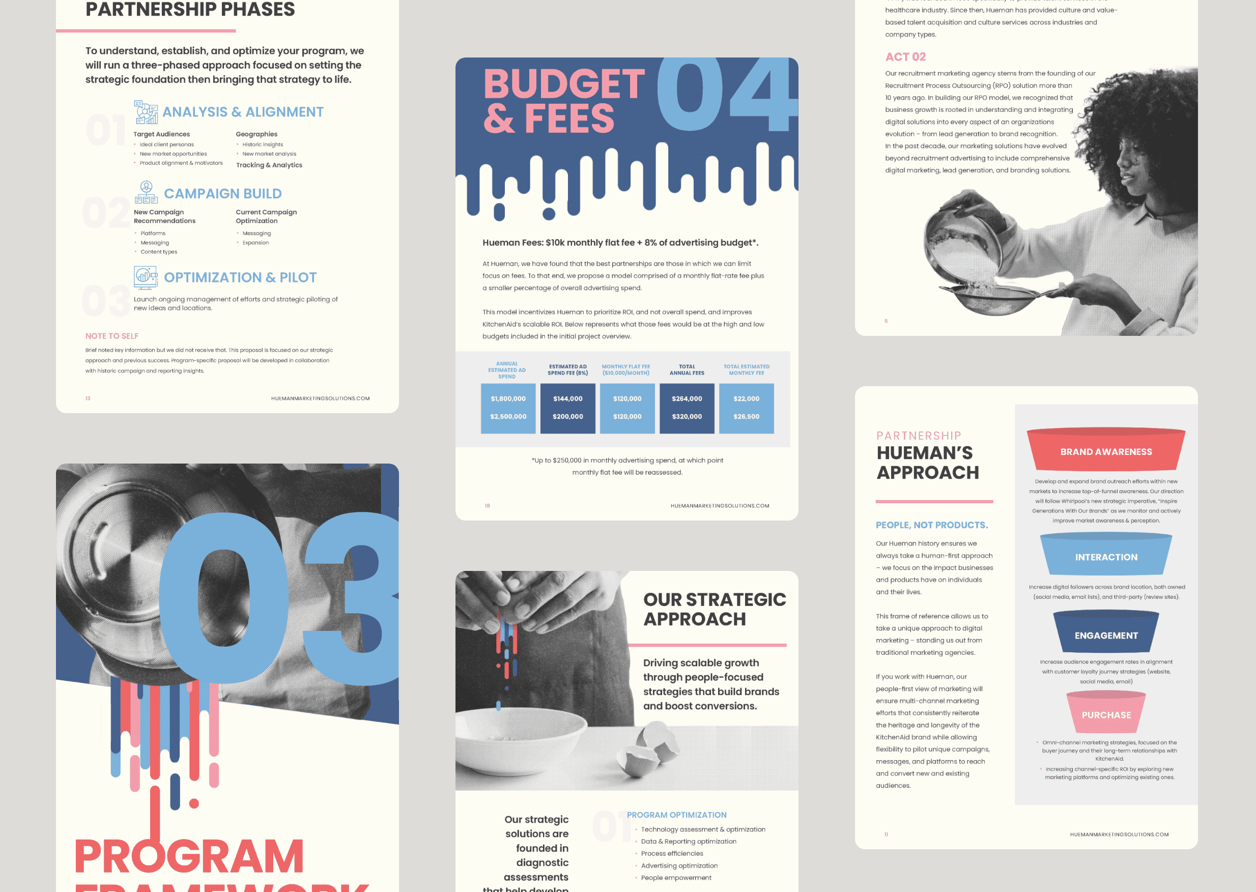
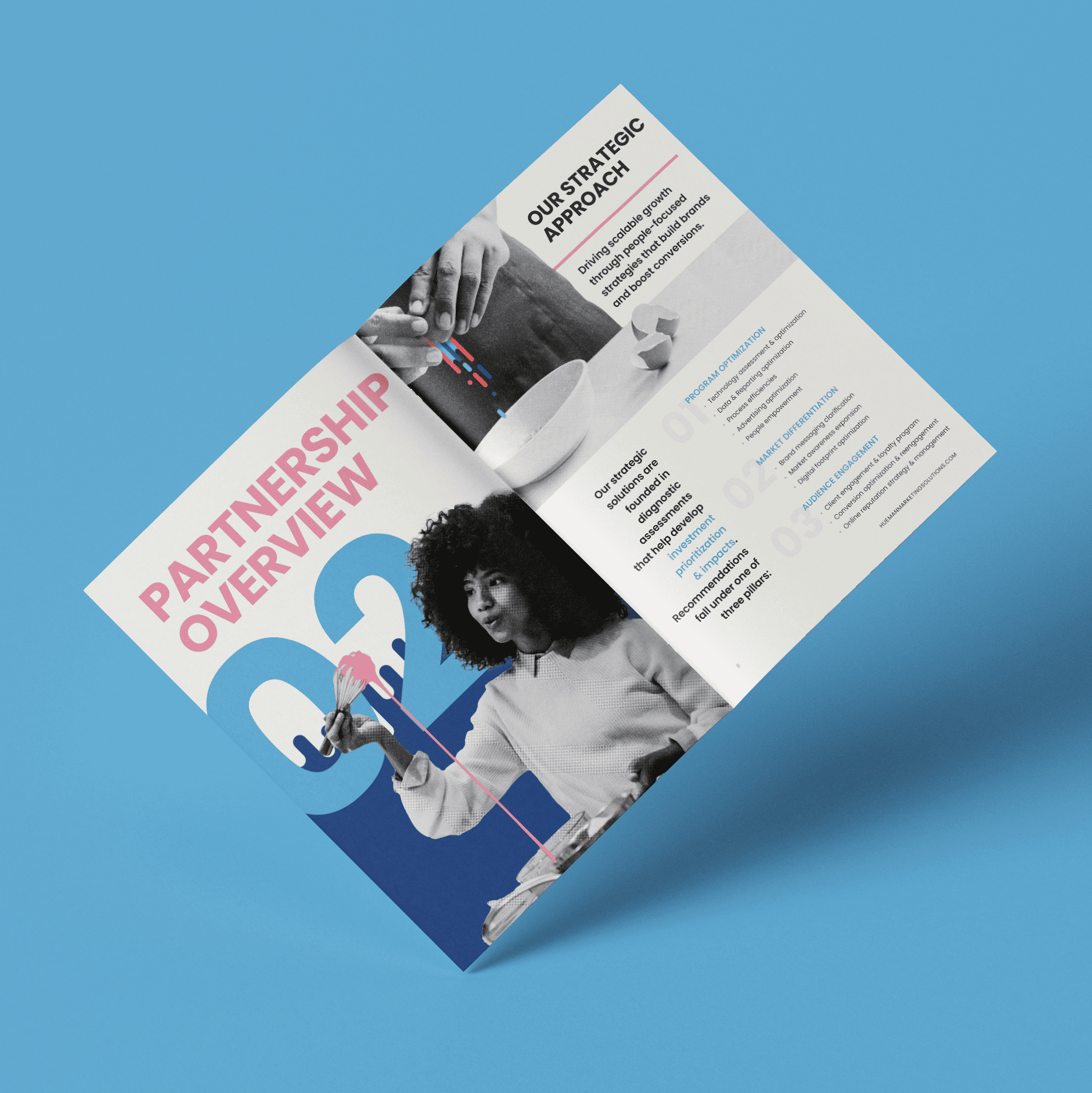
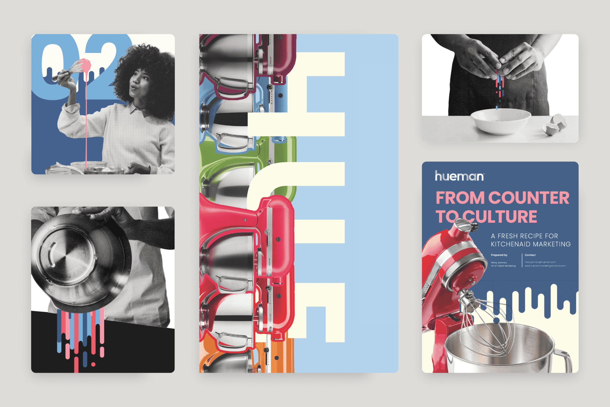
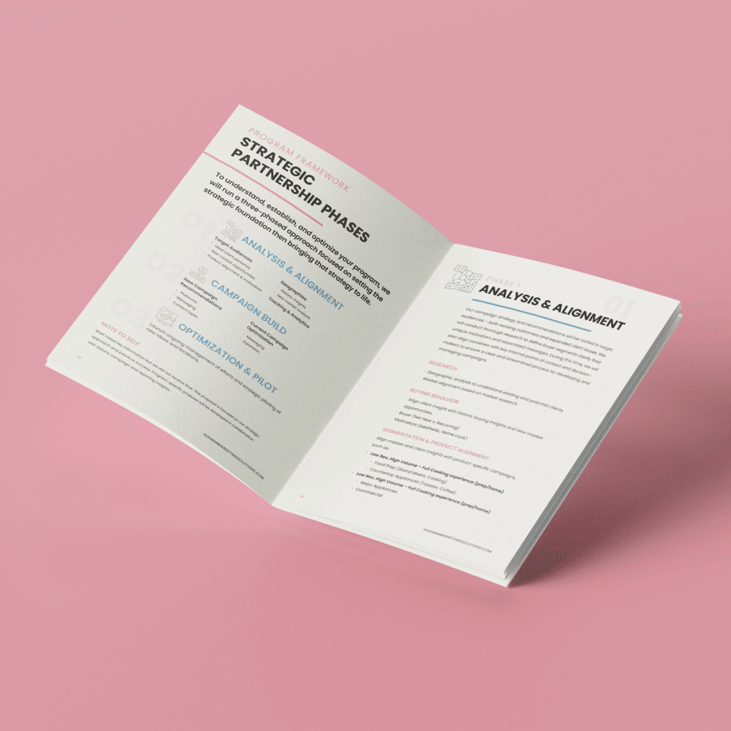
Designed in the Hueman DMO brand style, the proposal integrates KitchenAid elements throughout to align with the brand’s visual identity. The layout and tone are inspired by the the bold colors of the Hueman brand while incorporating core KitchenAid imagery, combining clean, confident messaging with strong visual storytelling.
PROJECT HUEMAN
CATEGORY DIGITAL DEISIGN
RESEARCH
Drawing inspiration from vintage KitchenAid advertisements from the 1950s, the design blends nostalgic, retro elements with bold, modern visuals—celebrating the brand’s long-standing legacy while positioning it with contemporary strength.
RESULTS
"This is a long-shot proposal, but this design work is truly world-class. I can honestly say that when we move forward it’s because of her eye-catching visuals.
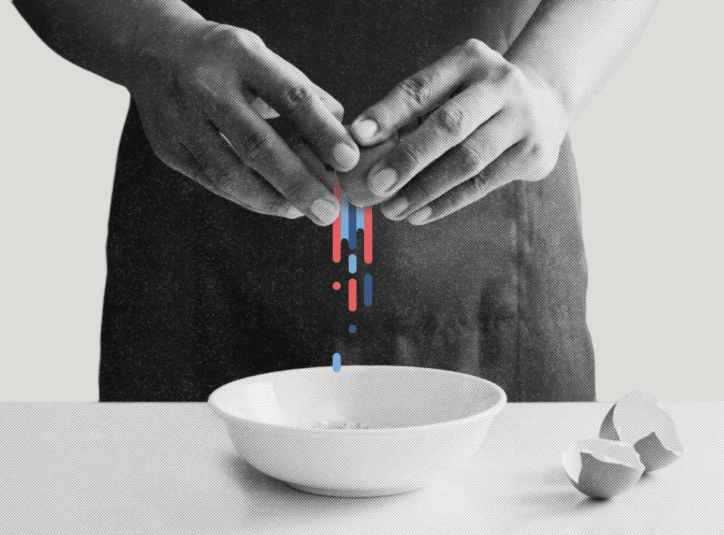
I have never worked with a designer who did more than just plug-and-play content into a visual. Whitney has elevated the content to match the brand – “From Culture to Counter” and “We don’t follow trends – we mix them up” were ALL HER. (Also, please check out the egg-cracking visual. I can’t.)
Whitney worked overtime to get this done so we could submit our proposal in time. And this is on top of wrapping up a critical video project.
5 million more reasons.
It’s rare that my expectations are completely blown away and Whitney has shattered any I thought I had."